square dining room
No long wall to lean on, no short wall to feature. The grid is the trap. Here is how that plays out in a dining room: the layout that survives it, the furniture worth keeping, the lighting plan, and a way to preview it all on a photo of your own room.
What a square dining room is really dealing with
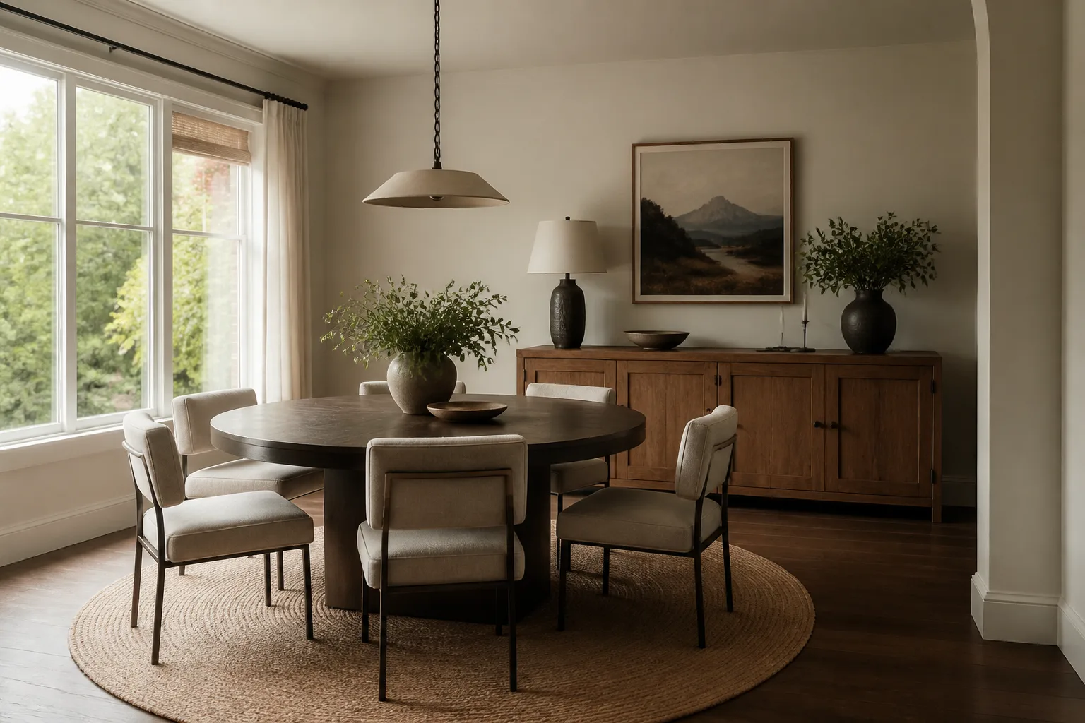
A square room has no natural hierarchy, so furniture tends to land in a ring around a centred rug under a centred light — static, waiting-roomish, and weirdly hard to fix by swapping pieces. The cure is to impose the asymmetry the architecture refused: one corner or one wall is declared the room’s centre of gravity and loaded, and the layout runs diagonally or off-centre against it. None of that changes what the room is for: a dining room is hired for the table, and the table’s geometry writes the room: 60cm of width per diner, 75cm from table edge to anything behind a chair, and a light source centred on the surface rather than the ceiling rose the builder happened to leave. Because it is used in the evening more than any other room, the dining room is the house’s one legitimate theatre — the place where dark walls, real candles and a slightly-too-good chandelier all pay their way.
The layout that gets both jobs done
Hold the dining room's own numbers first — place settings: 60cm width per person, 40cm depth to the centreline. Then let the constraint pick the arrangement: an off-centre layout: the seating group biased toward one corner; one wall loaded — storage, colour, art — and the others kept quiet; a piece set on the diagonal to break the grid.
Furniture that earns its floor here
The pieces a dining room cannot do without are the table the room deserves — the one piece worth over-spending on in this room, chairs comfortable at hour two, not just minute five, a pendant or chandelier centred on the table, not the room. Under the square condition, each of them is auditioned against the same test: an off-centre layout: the seating group biased toward one corner.
What to rule out on day one
The square version of this room punishes perfect symmetry: centred rug, centred pendant, furniture ringing the walls; four walls given equal treatment, which makes the room a box with padding. And the dining room's own classic error still applies: the pendant centred on the ceiling while the table shifted 40cm to fit the room — the room forever slightly wrong.
Lighting it
Kill the single centred pendant, or at least outnumber it: an off-centre floor lamp and two wall sources give a square room the shadows it needs to stop feeling like a lift lobby. The pendant does the theatre; a pair of lamps or sconces at the sideboard stop the corners dying; everything dims. The test is faces: light that lands on the table lights the people around it from below-centre, which is the most flattering light there is — as candles have always known.
The move to make this weekend
Choose the anchor wall — usually the one you face on entering — and move two-thirds of the room’s visual weight onto or toward it. Hierarchy appears, and every other choice gets easier. In a dining room that lands next to the fixed rule of the room: a sideboard needs 50cm of standing room in front, plus its drawer arcs.
Dimensions to hold onto
However the finishes go, the geometry stays: Chair push-back: 75cm to sit; 100cm if anyone walks behind seated diners; 120cm on the serving route. The pendant hangs 75–85cm above the table surface, sized about half the table’s width.
Questions
- Is a square dining room worth designing around?
- Yes — no long wall to lean on, no short wall to feature. The grid is the trap. The pages here treat the square condition as the starting brief, not a defect to apologise for.
- Which single change helps a square dining room most?
- Choose the anchor wall — usually the one you face on entering — and move two-thirds of the room’s visual weight onto or toward it. Hierarchy appears, and every other choice gets easier.
- How do I light a square dining room?
- Kill the single centred pendant, or at least outnumber it: an off-centre floor lamp and two wall sources give a square room the shadows it needs to stop feeling like a lift lobby.
- What gets bought and regretted most in this room?
- The pendant centred on the ceiling while the table shifted 40cm to fit the room — the room forever slightly wrong. Under the square condition, add: perfect symmetry: centred rug, centred pendant, furniture ringing the walls.
- Can I try these ideas on a photo of my own dining room?
- That is what the Studio is for: upload a photo of the actual room and redesign it with the square playbook applied. A new account starts with 4 free credits and a Standard render costs 4, so the first look is free.