Hallway Mistakes Everyone Makes
The recurring hallway errors — and what the room wants instead of each one. The room every other room is judged from. Usually decorated last, seen most.
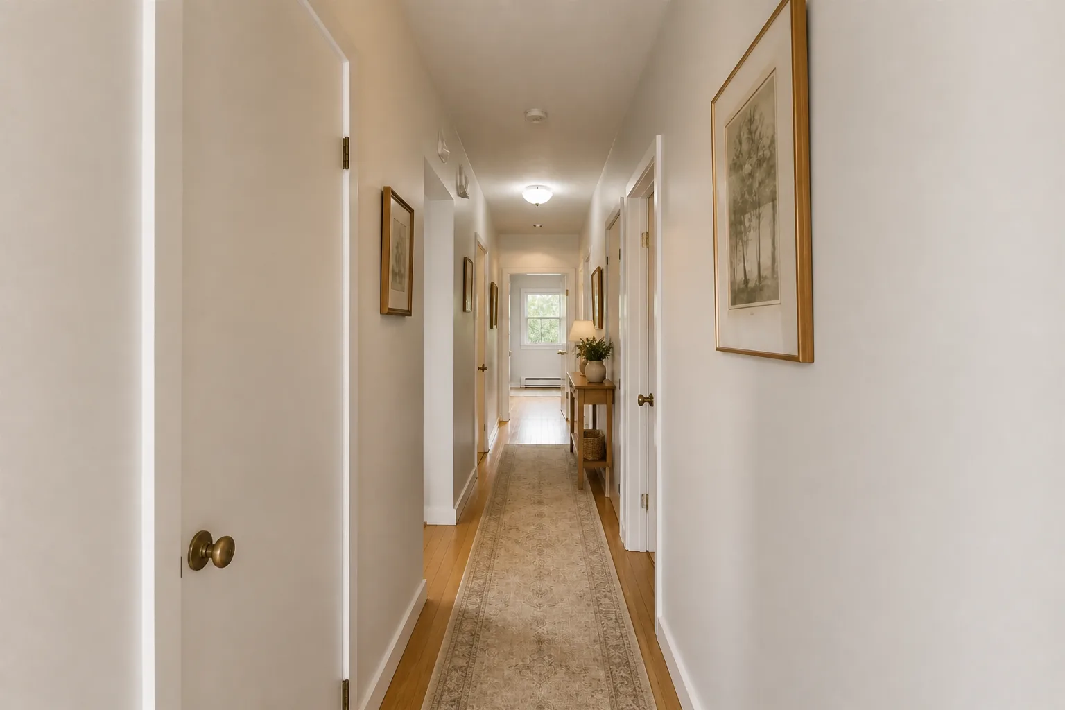 BeforeAfter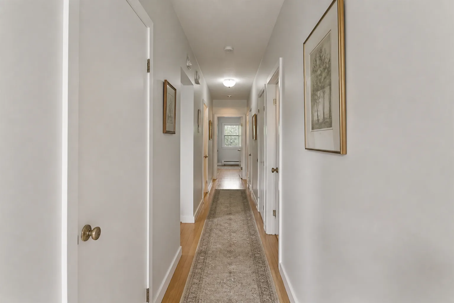
- 1
The classics, in order of damage
Painting it white "to keep it light" — a windowless white hallway is grey, and commits to nothing. One centre light serving twelve metres of corridor. Furniture ambitions that pinch the route below 80cm — felt by every laundry basket forever. Bare walls for years because "it’s just the hallway", in the most-seen room of the house.
- 2
Why they keep happening
Each mistake is the room’s job being overruled by habit or by the furniture that happened to be available. The correction is always the same move: restate the job — a hallway is hired for passage, which everyone furnishes for and nobody designs for: the real brief is that every room is entered THROUGH it, so its colour, light and state of repair set the baseline the rest of the house is read against. Design-wise it is a linear gallery with traffic — walls doing the work (art, colour, panelling), floor built for the house’s highest footfall, and furniture rationed to what leaves 90cm of passage. Its curse is the switch: dark, windowless middles lit by one pendant per decade of neglect.
- 3
The numbers that catch mistakes early
Most of these errors are visible with a tape measure before they are felt in use: Passage width: 90cm absolute working minimum; 100–110cm to pass someone without the shoulder dance. Furniture (console, bookcase) only where 90cm survives in front of it — 25cm-deep pieces are the hallway’s native species.
- 4
If the room is small, the stakes double
A narrow hallway goes bold, not pale: colour or panelling to dado height, a run of art above, warm light in rhythm — commitment reads as intent, and intent is what makes a corridor feel like part of the home rather than the gap between parts.
Questions
- What matters most in a hallway?
- A hallway is hired for passage, which everyone furnishes for and nobody designs for: the real brief is that every room is entered THROUGH it, so its colour, light and state of repair set the baseline the rest of the house is read against. Design-wise it is a linear gallery with traffic — walls doing the work (art, colour, panelling), floor built for the house’s highest footfall, and furniture rationed to what leaves 90cm of passage. Its curse is the switch: dark, windowless middles lit by one pendant per decade of neglect.
- Which numbers should I check before buying anything?
- Passage width: 90cm absolute working minimum; 100–110cm to pass someone without the shoulder dance.
- Can I preview this on my own hallway?
- Upload a photo in the Studio and run the ideas on the real room. New accounts start with 4 credits and a Standard render costs 4, so the first experiment is free.