square kitchen-diner
No long wall to lean on, no short wall to feature. The grid is the trap. Here is how that plays out in a kitchen-diner: the layout that survives it, the furniture worth keeping, the lighting plan, and a way to preview it all on a photo of your own room.
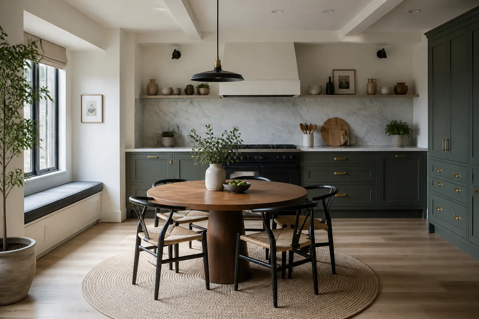
What a square kitchen-diner is really dealing with
A square room has no natural hierarchy, so furniture tends to land in a ring around a centred rug under a centred light — static, waiting-roomish, and weirdly hard to fix by swapping pieces. The cure is to impose the asymmetry the architecture refused: one corner or one wall is declared the room’s centre of gravity and loaded, and the layout runs diagonally or off-centre against it. None of that changes what the room is for: a kitchen-diner is hired for togetherness — cooking and eating as one continuous social event — and its design problem is that the two halves experience each other constantly. The diners see the kitchen: it needs a calm face, closed storage toward the table, the sink ideally not the vista. The kitchen hears the diners: the cook faces the table for the social payoff the room was built for. And the boundary needs marking without walls — a level change of light, a peninsula, the rug under the table — so dinner does not feel like eating in a workroom.
The layout that gets both jobs done
Hold the kitchen-diner's own numbers first — all kitchen rules apply, plus: 120cm between the table zone and any working run, so chairs and cooks never negotiate. Then let the constraint pick the arrangement: an off-centre layout: the seating group biased toward one corner; one wall loaded — storage, colour, art — and the others kept quiet; a piece set on the diagonal to break the grid.
Furniture that earns its floor here
The pieces a kitchen-diner cannot do without are a table sized to the daily headcount, not the fantasy dinner party, a peninsula or island as the border checkpoint, pendants over the table claiming it as a place. Under the square condition, each of them is auditioned against the same test: an off-centre layout: the seating group biased toward one corner.
What to rule out on day one
The square version of this room punishes perfect symmetry: centred rug, centred pendant, furniture ringing the walls; four walls given equal treatment, which makes the room a box with padding. And the kitchen-diner's own classic error still applies: the table as overflow counter, permanently half-cleared, so the room has two work zones and no dining room.
Lighting it
Kill the single centred pendant, or at least outnumber it: an off-centre floor lamp and two wall sources give a square room the shadows it needs to stop feeling like a lift lobby. Two rooms’ worth on separate circuits: kitchen task light that can go OFF while the table pendants stay warm — the single switch-flip that turns the workroom into a dining room at 8pm. Nothing kills the dinner like the extractor’s floodlight over the empty hob.
The move to make this weekend
Choose the anchor wall — usually the one you face on entering — and move two-thirds of the room’s visual weight onto or toward it. Hierarchy appears, and every other choice gets easier. In a kitchen-diner that lands next to the fixed rule of the room: extraction sized to the room’s honesty: an open plan means dinner smells reaching every seat, and the fan is the only defence.
Dimensions to hold onto
However the finishes go, the geometry stays: The table needs 90cm from its edge to walls or units for seated access; 110cm on the serving side. The kitchen’s open shelving faces the cook; the closed faces face the diners.
Questions
- Is a square kitchen-diner worth designing around?
- Yes — no long wall to lean on, no short wall to feature. The grid is the trap. The pages here treat the square condition as the starting brief, not a defect to apologise for.
- Which single change helps a square kitchen-diner most?
- Choose the anchor wall — usually the one you face on entering — and move two-thirds of the room’s visual weight onto or toward it. Hierarchy appears, and every other choice gets easier.
- How do I light a square kitchen-diner?
- Kill the single centred pendant, or at least outnumber it: an off-centre floor lamp and two wall sources give a square room the shadows it needs to stop feeling like a lift lobby.
- What gets bought and regretted most in this room?
- The table as overflow counter, permanently half-cleared, so the room has two work zones and no dining room. Under the square condition, add: perfect symmetry: centred rug, centred pendant, furniture ringing the walls.
- Can I try these ideas on a photo of my own kitchen-diner?
- That is what the Studio is for: upload a photo of the actual room and redesign it with the square playbook applied. A new account starts with 4 free credits and a Standard render costs 4, so the first look is free.