awkward study
Angled walls, odd nooks, a door too many. The flaw is the plan’s best feature. Here is how that plays out in a study: the layout that survives it, the furniture worth keeping, the lighting plan, and a way to preview it all on a photo of your own room.
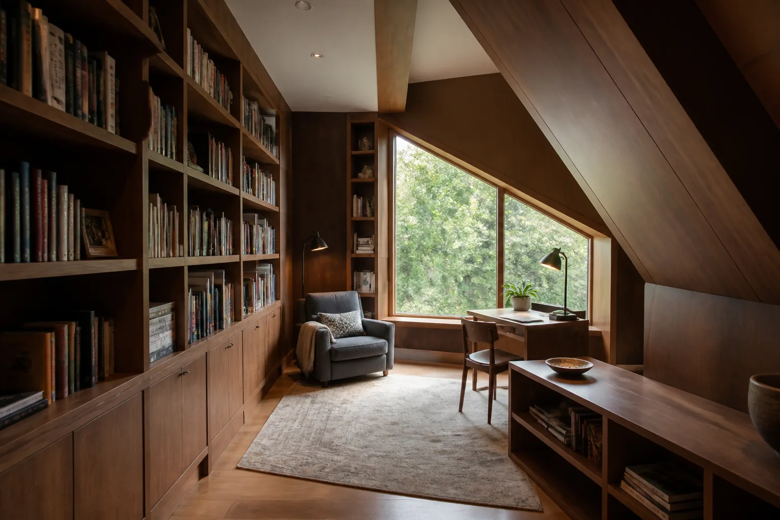
What a awkward study is really dealing with
Awkward rooms — the wedge, the room with five walls, the one with a chimney breast and three doors — lose when furnished in denial, with rectangular arrangements floating in a non-rectangular plan. They win when the oddity is promoted: the deep nook becomes the reading seat, the angled wall takes the desk built to match, the chimney breast becomes the shelving spine. Every awkward room has one feature a rectangular room would pay for; the design job is finding it. None of that changes what the room is for: a study is hired for depth — reading, writing, thinking — where the home office is hired for throughput. That difference licenses everything the office forbids: darker colour, heavier furniture, books as the primary wall material, a chair for reading that competes with the desk for the room’s best corner. The study’s enemy is not distraction but interruption; it wants a door, mass, and an atmosphere that makes speaking loudly feel like a category error.
The layout that gets both jobs done
Hold the study's own numbers first — desk rules carry over: 120×60cm, chair zone 75cm, side-on window light. Then let the constraint pick the arrangement: the oddity claimed by a purpose — nook as seat, angle as desk wall, recess as shelving; one custom or cut-to-fit piece where the geometry breaks; standard pieces everywhere else; continuous floor and wall colour, so the shape reads as sculpture rather than mistake.
Furniture that earns its floor here
The pieces a study cannot do without are floor-to-ceiling books on at least one wall, a desk with drawers — the study keeps its tools close, the reading chair, given the corner a lesser room would waste. Under the awkward condition, each of them is auditioned against the same test: the oddity claimed by a purpose — nook as seat, angle as desk wall, recess as shelving.
What to rule out on day one
The awkward version of this room punishes furniture squared to walls that are not square to each other; leaving the odd corner empty, which spotlights it as a defect. And the study's own classic error still applies: shelving too shallow for real books, styled with objects where the books should be.
Lighting it
Light the oddity deliberately — a nook with its own lamp reads as designed, the same nook in shadow reads as a defect the lighting is hiding. Pools, deliberately unequal: desk task light, a reading lamp at the chair, shelf lighting if the books deserve it, and the general layer kept low and warm. A study lit evenly is an office with a costume on.
The move to make this weekend
Stand in the doorway and find the room’s one genuine gift — the nook, the angle, the unexpected recess — and give it a job this week. Once the oddity is working, the rest of the room can be furnished as the plain room it mostly is. In a study that lands next to the fixed rule of the room: ladder or step access once shelving passes 2.1m — planned, not improvised.
Dimensions to hold onto
However the finishes go, the geometry stays: Bookshelves at 28–32cm depth handle almost everything; keep one 40cm run for the oversized shelf. A reading chair with 70cm legroom, a table within a forearm’s reach, and light over the shoulder, not the ceiling.
Questions
- Is a awkward study worth designing around?
- Yes — angled walls, odd nooks, a door too many. The flaw is the plan’s best feature. The pages here treat the awkward condition as the starting brief, not a defect to apologise for.
- Which single change helps a awkward study most?
- Stand in the doorway and find the room’s one genuine gift — the nook, the angle, the unexpected recess — and give it a job this week. Once the oddity is working, the rest of the room can be furnished as the plain room it mostly is.
- How do I light a awkward study?
- Light the oddity deliberately — a nook with its own lamp reads as designed, the same nook in shadow reads as a defect the lighting is hiding.
- What gets bought and regretted most in this room?
- Shelving too shallow for real books, styled with objects where the books should be. Under the awkward condition, add: furniture squared to walls that are not square to each other.
- Can I try these ideas on a photo of my own study?
- That is what the Studio is for: upload a photo of the actual room and redesign it with the awkward playbook applied. A new account starts with 4 free credits and a Standard render costs 4, so the first look is free.